Contrast. Texture. Flow.
These are the main building blocks I think about, when drawing a tattoo design, and later on when bringing it to your skin.
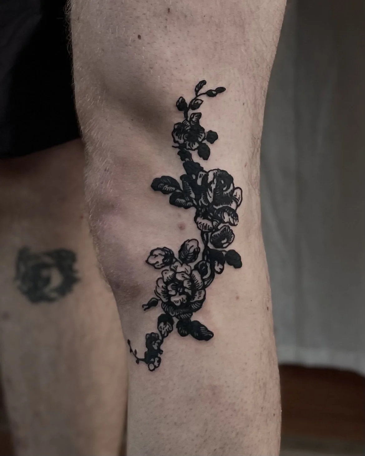
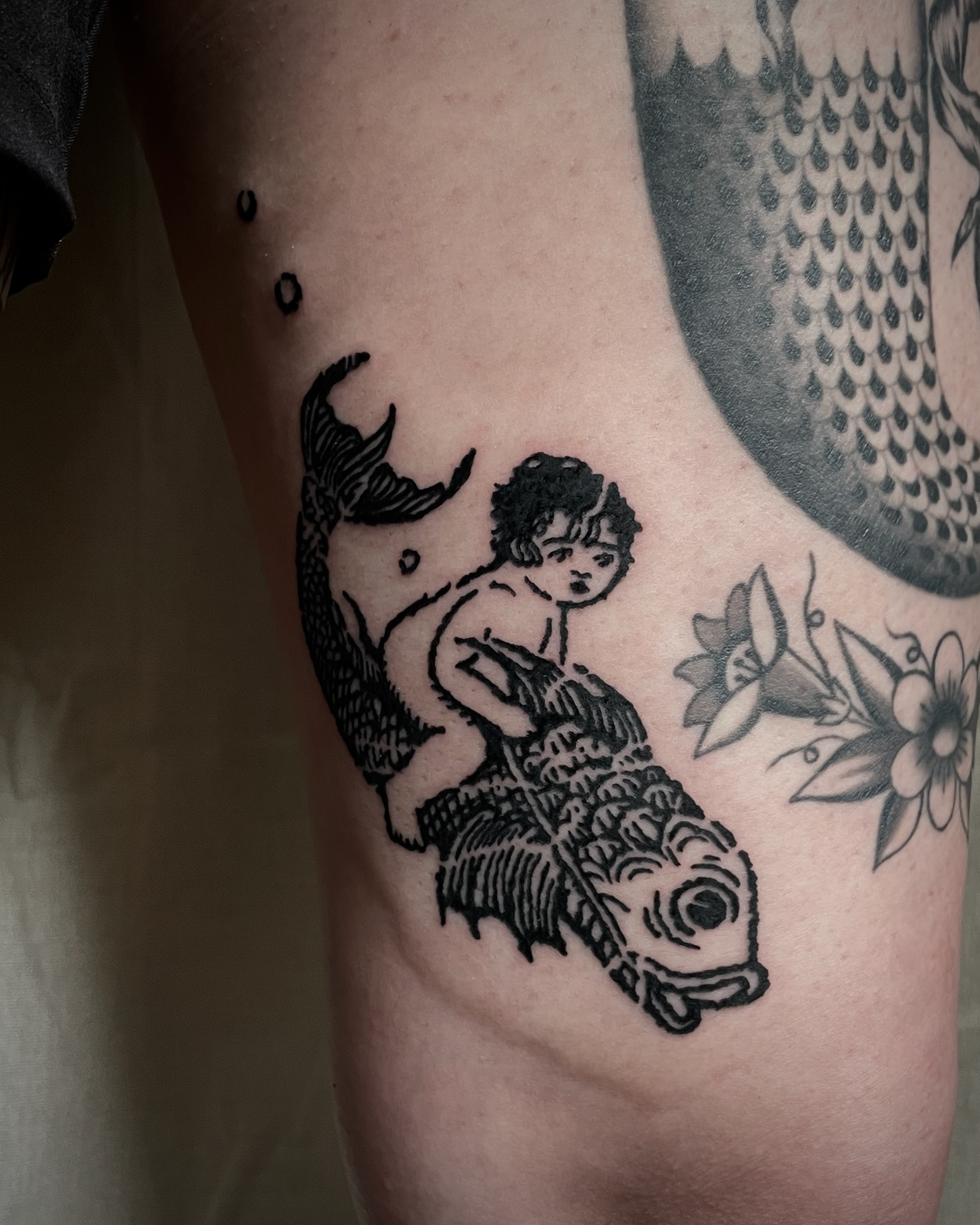
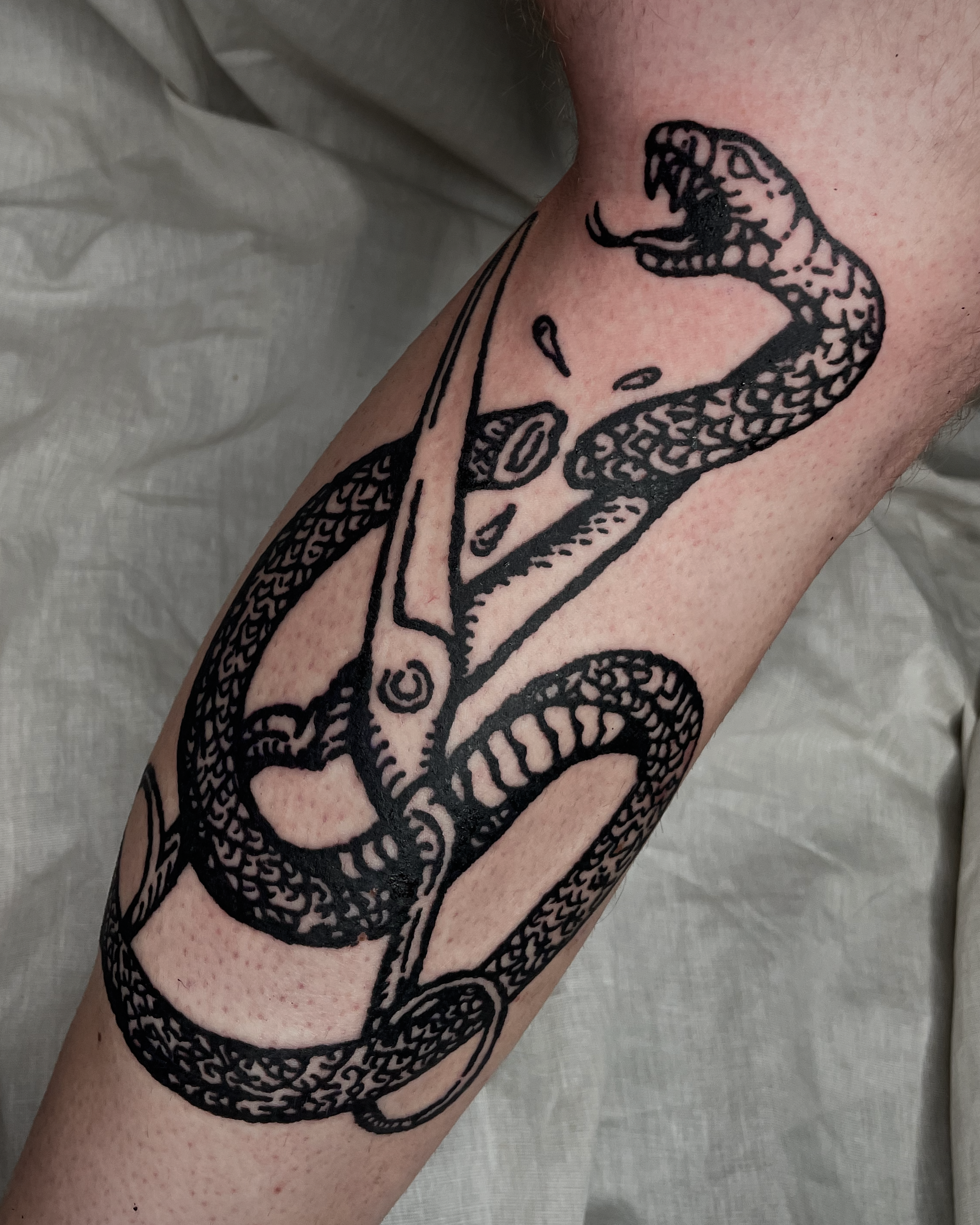
Contrast
This has nothing to do with skin tone, the contrasts I’m interested in are the contrast between thicker and thinner lines, between dark aesthetics and light subjects, between blacked out areas and open skin.
I think it’s all about balance, and I love how these contradictions come together and at the same time enhance and soften each other out.
Texture
The reason I love tattooing with texture, is because that’s what feels the most natural to me. Our skin is textured, and therefore it makes sense to me, when adding onto it, that the tattoo be textured as well. It feels like a natural part of your skin.
When they age, our tattoos feather out slightly, the lines become more uneven. But when texture is part of the artwork to begin with, these changes only enhance what is already there.
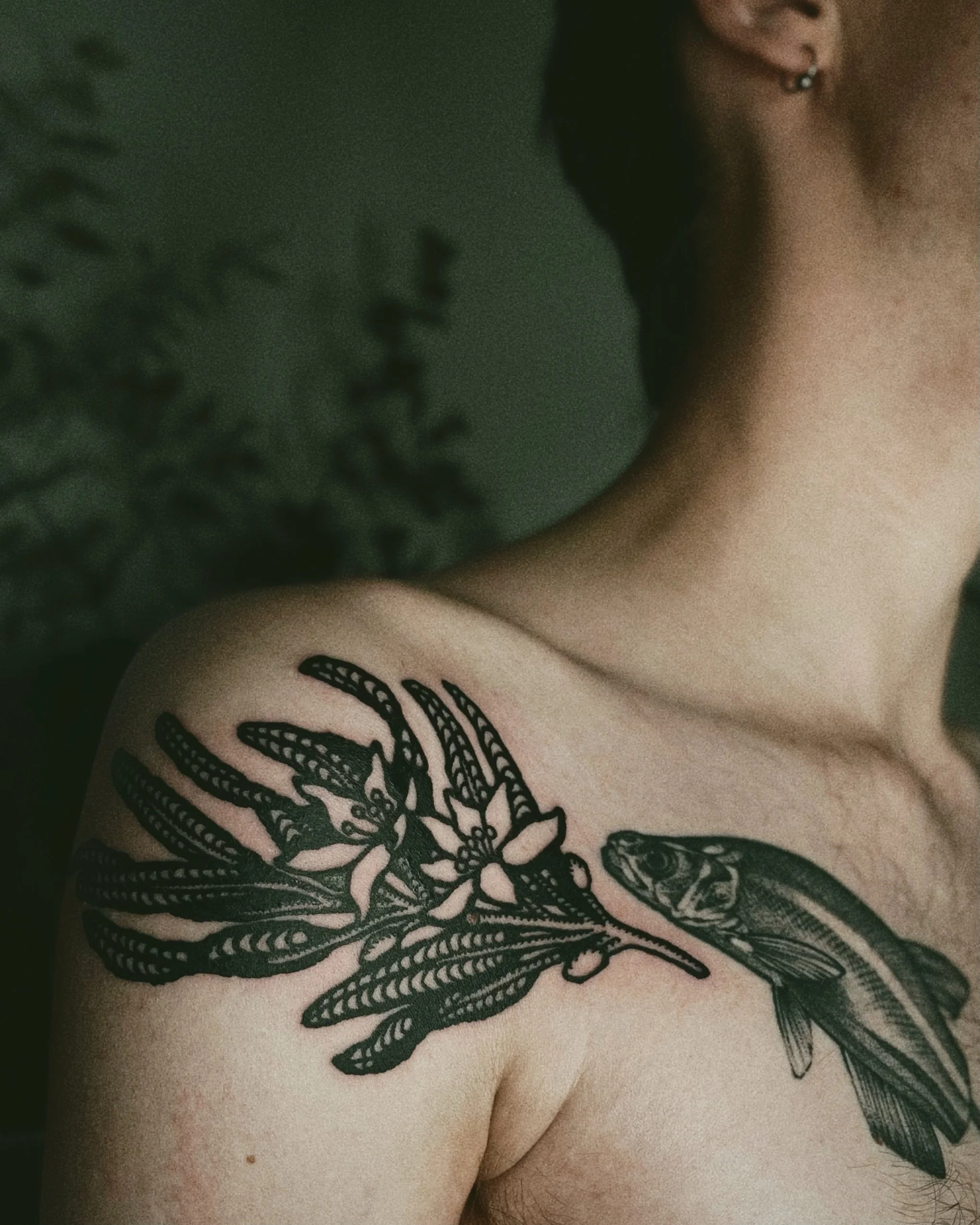
Flow
Placement is just as important as the design of the tattoo itself. It can absolutely make or break a tattoo. Tattoos should always be placed with regard to your body’s natural movement. In general, you would choose to follow its natural flow, and enhance its lines.
Some people may choose to purposefully go against these lines to play with movement and shape, but all that should be intentional. The visual effect of a placement can not be overstated.